Thinking About Analysis
When I started on my journey into the world of data and analysis, I started from the middle and worked my way out. I started by reading all the hyped news and social media posts that got me excited about machine learning, AI and other buzzwords before I really had any idea what the core principles of becoming a good analyst was. In an attempt to try and stop you from making the same mistakes, I’ve tried to jot down some of my core learnings so far in my journey of becoming an analyst.
I’m going to start from the start so if you feel like I’m covering things you already know, please feel free to skip ahead!
Why should you improve your analysis skills?
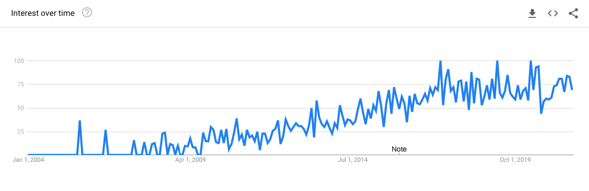
Simple. It will make your life easier. As the world moves deeper into the data economy, a strong skill set in data analysis will only be more valuable. Don’t take my word for it, here’s the Google Trends chart for the number of searches for “learn analytics” worldwide since 2004.
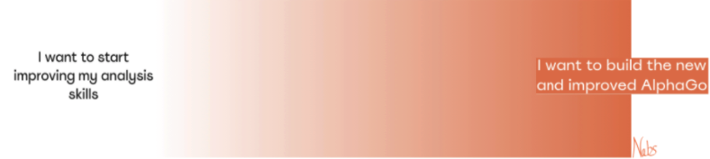
Organisations from all industries are pushing to be more data-driven, as much as that’s a cliche term, it’s still important. If you have the skills to correctly use data to help make decisions, you will only be more of an asset to any team. The media hype around artificial intelligence and machine learning has led some people to believe that you can only make an impact if you build the next AlphaGo. This is not true. Very often the most impactful analysis I’ve seen is in a Google sheet. A simple chart, with clear analysis and a coherent narrative.
Additionally to improve your analysis muscle you will inadvertently learn how to use some data tools. The tools themselves can be the leverage you need. You can use these tools to increase your own efficiency or that of your team. This additional time opens up more brainspace to work on interesting problems, or to take a long lunch. I won’t judge which you chose but it’s undeniable that either option is beneficial.
What should you improve?
If you’re still with me, you agree that improving your data skills will make your life better. Great! Now where do we start? There is a world of courses, textbooks, software and videos available for you to use. But unless you’re clear on what you need to improve, this wealth of information is rather useless. To help uncover what to focus on, I’ve created the “data makes life easier” (DMLE) spectrum:
Irrespective of where you sit on that spectrum when you face an analysis task, your first step will be looking at the data. If you’re lucky your data will look like this.

More than likely your data will actually look like this.

What an analyst needs to do is use a tool to take the data from a bunch of unruly lines and turn it into something that’s actionable. Think of yourself as a journalist with technical skills. You are uncovering the story behind the data and reporting it to a broader audience. You want your story to have a clear narrative and be convincing. You want people to act because of your analysis.
To do this well involves developing the right understanding in three key skill areas:
- Tools: The various software you can use to help clean up the data and simplify it for analysis.
- Skills: The frameworks and knowledge you can lean on when doing analysis.
- Practical knowledge: I know you don’t want to hear this but unfortunately practice is the best way to build up practical knowledge. Although I have tried to collate some of the key practical things I’ve learned over the years to help create some structure to this.
I’ve broken down the required three skills areas by the DMLE spectrum and added where I think each skill sits along the spectrum.
So what do you need to do?
- Pick a point on the spectrum where you think you currently sit
- Pick a point on the spectrum where you would like to sit
- Start learning the skills. Start with the tools, then move to technical knowledge and finally cement your previous learning by putting them into practice.
Tools
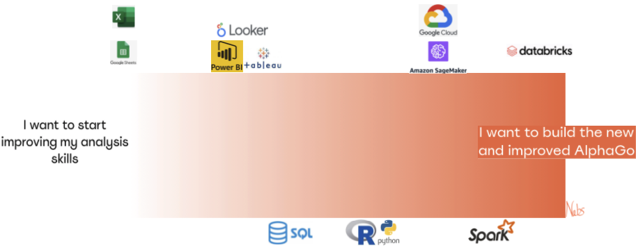
There is an abundance of tools and I’ve only captured some of the bigger names. The idea is that if you learn one of the tools within the sub-category, learning the other tools is easier. I’ve created another blog post here with a breakdown of the best resources I’ve come across to help you learn these tool.
Skills
Coming Soon
Practical Knowledge
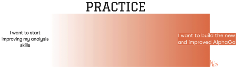
I know, I know. I’m sorry. If you’ve made it down to this part of the page, you may have been hoping for a Matrix-like solution on learning years of practical experience by downloading the information onto your ‘hard drive’. Unfortunately, this doesn’t exist or if it does I haven’t found it yet. The best way to cement your knowledge is to practice. What I can help with is some suggestions on the best ways to practice.
My favourite and what I believe to be the most beneficial approach is to find opportunities in your day job where you can apply the skills you’re learning. You will be surprised how much work there is for someone who has a basic understanding of spreadsheets. The biggest roadblock here is not the limit on work but rather the lack of awareness. The people who are doing the task may not know of a better solution and the people who have the solution don’t know about the tasks. You can be the bridge between these two. Get creative, check if your lecturer needs help tracking student results or see if you can help track sales results for the corner store or restaurant you work at.
If that’s hard to find, there are some great free datasets available online. My go-to is Kaggle but most government organisations also publish really interesting data, here’s a link to Singapore and Australia’s two of the more comprehensive government data sources.
My suggestion is to try and combine a few of these datasets. It’s interesting to see the increase in education rates across countries. But cross-reference that against growth in GDP, is there some correlation? Think outside the box.
Good luck! As always, please reach out if you have any questions or feedback.